Ah, word games. If I were to pick a favorite game genre outside of strange, unnecessarily complicated plot RPGs from the land of the rising sun, and that game genre also happened to be one that I actually had time for, it'd be word games. A memorable part of my engagement was being completely destroyed by my fiancée at a rummy word-building card game. Since then we've played so many Boggle-type games on our iPod Touches that we've had to retire the rummy word game (the player with the first turn always goes out on the first turn and the second player can always show that they were about to go out). But Boggle, Scrabble and other word games fill much family time on holidays and much wait time with our Apple devices.
One of the first things I looked for when the App Store opened was Boggle. Of course, Parker Bros./Hasbro had not even licensed their games to Electronic Arts until August of 2007, two months after the App Store's opening. So I was left looking around at reviews and best-of lists for top contenders. For myself, the options were Wurdle and Quordy. Wurdle was more popular and allowed larger grids of letters, while Quordy lured me with smoother graphics and great UI feedback. In the end I chose Quordy because I liked the simple difficulty that a four by four grid presented and preferred its interface. Along the way many other games came along but I stuck with Quordy, only slightly annoyed at times by its wordlist and occasionally delighted by their addition of versatile multiplayer options.
I was interested to finally see Boggle launch on the App Store and more than ready to try it out. What I found was a good 1.0 game with an interesting approach but lacking a lot of the polish that the veteran apps have added along the way.
Basic Gameplay and Interface
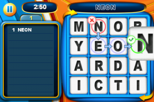 Anyone who has played Boggle will know the premise, find words by moving about the four by four grid horizontally, vertically, or diagonally (and no letters may be used more than once). Boggle for the App Store platform approaches word formation a little differently than the other apps I've tried. When you select a string of letters, the first letter block you select will be highlighted in red with an X appended to one corner. The last letter block you select will be highlighted in green and receive a check mark. Any other letters in the middle of your potential word are highlighted in blue with arrows pointing in the direction of your swipe. If you've ever played Quordy or Wurdle, this may frustrate you. In those other games, if you make a mistake in drawing out your path/word, you just re-swipe. Doing that in Boggle will cause a lot of frustration. The beginning of your re-swipe will press the X on the first letter and you'll lose that letter and have to re-swipe a second time. However, it's an interesting design choice, because it does allow for quick correction once you get used to it. You simply swipe again on any letter after the first one and Boggle corrects the selection. If your error was at the end of the word (or on the middle of a long word) this can be a much faster process. If you messed up on the second letter (which, I admit, is not as likely) then you're going to have to go thru the two step process of hitting the X and re-swiping. That might seem a little annoying to people who have grown used to another paradigm. Oh, and if your selection is not accepted as a word, you'll have to click X and then swipe somewhere else. Little second clicks like this can be an annoyance for some.
Other aspects of the basic interface include using a multi-touch two-finger twist to rotate the game board (and rotation is essential to finding words, as any Boggle addict will understand), a small bar that displays the selected letters, and a display to the left that shows your discovered word list/score. The rotation works well and the wordlist/score section would be pretty tough to design badly, my only complaint is with that small bar.
That bar is an example of a compromise that really doesn't suit the game. The various incarnations of grid word-find games on the App Store do one of two things. The apps I've mentioned before are the best examples. One approaches the four by four grid traditional model and tries to make the interface the best it can be, maximizing space and eliminating any possible problems with missed swipes. The other says, "Is 4x4 too small for you? Well we've got 25, 36, 49 and 64 space grids just in case you wanna pour over infinite word options." Those denser grids are contain much more variety but you're going to misplay much more often. It all depends on which one the user finds the most valuable. Boggle is faithful to its brand and only makes some minor changes to the formula (like custom timing and their "Advanced" and "Self Score" modes) but doesn't optimize their interface for that "Classic" grid. It seems a little too easy to make mistakes on the grid because they have to make room for a bar that could just as easily be moved to the left with the score section. The grid should be as big as it can be since it's the focus of the game. It'd be fine to leave the little arrows that give users a clue that they can rotate the board. What's left without this enlargement is an experience that's worse than the other four by four games and offers less variety than the eight by eight. There's enough in the other game modes to eliminate the need for these kind of compromises
Other Gameplay Modes
As I mentioned a moment ago, Boggle also includes two other game modes for players. Both modes allow for play times between one minute and ten minutes.
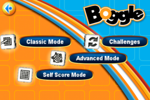 Advanced mode is an attempt to make things a bit more strategic for advanced players. It features two small twists that significantly change gameplay. The first is that every time you find a word, the first and last letters in that word will switch places on the board. This "Portal Cube" option changes the way that players approach the game by, at the surface, encouraging them search for longer words initially. Little things that a lot of Boggle veterans do normally, like grabbing words and then going back for plurals of those words, will not work in this mode. You'll always want to grab the plural first, and then, if you're lucky, the singular form might still be there. The other side of this is that it means the board is constantly changing, giving and taking away opportunities as you go. What was a fabulous board at the beginning of the game may be terrible at the end and vice versa. It adds a nice randomness that keeps games fresh. Oh, and those boards that morph into fabulous ones in the last minute or so, don't get too used to those, cause advanced mode also includes the option for a "Panic Flip", which completely resets the board in the last 20 seconds. Again, sometimes good, sometimes bad, but a nice option to have. Both "Portal Cube" and "Panic Flip" can be individually turned off but then you'd basically be playing Classic.
Self Scored mode is simply a mode that's for a traditional group game of Boggle. It comes up with a timer and a game board and you can get out scratch paper for a group game. You can rotate the board at the group's request and even schedule a "Panic Flip". Certainly not a mode that required a lot of overhead in development, but a nice touch for a get-together where everyone's sad that they can't find Boggle. With a video out cable, I think this might be a lot of fun.
Online and Network Play
Online play consists of a single option to email a friend at the end of a game. They receive a link that, when opened on an iPhone or iPod Touch, attempts to open Boggle. There's also a link to Boggle on the App Store, in case your friend needs to purchase it. If they have Boggle and accept the challenge, it will open the same board and notify them of your score. Once they've played you'll receive their score in the Challenge section of Boggle.
There are no options for passing back and forth the game or any networked/bluetooth simultaneous play. One can only hope that this will be an option in the future, since some of us don't want to use pen and paper.
Graphics, Sound and the Rest
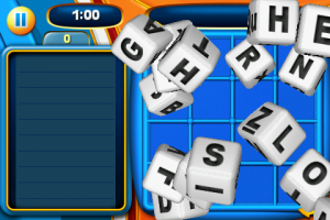 EA and Hasbro didn't have to think hard about color scheme of this app. The branding is clear and well done. Graphics are not really the focus here, but they did well. The initial shake you provide to start the game begins a dice roll that's reminiscent of the Motion X Dice/Poker games, except that the dice spring upward like they're made of something between Superballs and Flubber. It's a fun effect but not quite right while really inconsequential, so I'll quit being picky.
The music is the same as music for a lot of games, a small loop that is extremely annoying after a while. Thankfully, EA allows you to use your own playlists/library within the app. Other sound effects are appropriate for the genre.
The word list seems to be pretty good, though I have heard some complaints about the exclusion of anything considered obscene (which we know can also include proper english words). An option to enable/disable this would be great.
One last thing I have to mention. While exploring the Settings, I found a item that perplexed me at first. It was labeled "Advanced Settings/Opt-Out". Clicking into this setting doesn't seemed to provide anything in the way of advanced options, rather it simply seems to be a way of opting out of the gathering of usage statistics. While EA states that this info won't be shared with third parties, it still bothered me a bit. Especially since the default is Opt-In. I'm of the opinion that things like this should always be Opt-Out by default. I wonder if EA is trying to provide some level of transparency by including the option as we've seen articles written about under-the-table usage information gathering. Still, the menu item is not terribly informative to the average user, who will probably discount it as advanced options that they'd never use. A label of "Usage Info Opt-In" (or Out, if they insist on the default) would be better, but just asking the user initially would be much better.
Final Thoughts
I'd simply advise fans of word games to wait on this one. There are some great features in the Advanced mode of this app, but the rest seems like it needs time and polish. In addition, this has the normal 1.0 bugginess and occasional slowdowns. There are just too many other Boggle-like apps out there that perform at a superior level to recommend this one in its current form. New iPhone users with no prior experience will probably enjoy it, but users of the other apps won't want to switch. A good effort by EA, just not as great as the others. Name recognition will, no doubt, lead to a lot of sales.
PocketGamer.com
AppSpy.com
148Apps.com
PocketGamer.fr
PocketGamer.biz
PCGamesInsider.biz
The Sims News
PocketGamer.fun
BlockchainGamer.biz
PG Connects
BigIndiePitch.com
MobileGamesAwards.com
 U.GG
U.GG
 Icy Veins
The Sims Resource
Fantasy Football Scout
GameKnot
Addicting Games
 Arcade Cloud
 Wisecrack
 EV.IO
EV.IO
Luminosity
 Anyone who has played Boggle will know the premise, find words by moving about the four by four grid horizontally, vertically, or diagonally (and no letters may be used more than once). Boggle for the App Store platform approaches word formation a little differently than the other apps I've tried. When you select a string of letters, the first letter block you select will be highlighted in red with an X appended to one corner. The last letter block you select will be highlighted in green and receive a check mark. Any other letters in the middle of your potential word are highlighted in blue with arrows pointing in the direction of your swipe. If you've ever played Quordy or Wurdle, this may frustrate you. In those other games, if you make a mistake in drawing out your path/word, you just re-swipe. Doing that in Boggle will cause a lot of frustration. The beginning of your re-swipe will press the X on the first letter and you'll lose that letter and have to re-swipe a second time. However, it's an interesting design choice, because it does allow for quick correction once you get used to it. You simply swipe again on any letter after the first one and Boggle corrects the selection. If your error was at the end of the word (or on the middle of a long word) this can be a much faster process. If you messed up on the second letter (which, I admit, is not as likely) then you're going to have to go thru the two step process of hitting the X and re-swiping. That might seem a little annoying to people who have grown used to another paradigm. Oh, and if your selection is not accepted as a word, you'll have to click X and then swipe somewhere else. Little second clicks like this can be an annoyance for some.
 Advanced mode is an attempt to make things a bit more strategic for advanced players. It features two small twists that significantly change gameplay. The first is that every time you find a word, the first and last letters in that word will switch places on the board. This "Portal Cube" option changes the way that players approach the game by, at the surface, encouraging them search for longer words initially. Little things that a lot of Boggle veterans do normally, like grabbing words and then going back for plurals of those words, will not work in this mode. You'll always want to grab the plural first, and then, if you're lucky, the singular form might still be there. The other side of this is that it means the board is constantly changing, giving and taking away opportunities as you go. What was a fabulous board at the beginning of the game may be terrible at the end and vice versa. It adds a nice randomness that keeps games fresh. Oh, and those boards that morph into fabulous ones in the last minute or so, don't get too used to those, cause advanced mode also includes the option for a "Panic Flip", which completely resets the board in the last 20 seconds. Again, sometimes good, sometimes bad, but a nice option to have. Both "Portal Cube" and "Panic Flip" can be individually turned off but then you'd basically be playing Classic.
 EA and Hasbro didn't have to think hard about color scheme of this app. The branding is clear and well done. Graphics are not really the focus here, but they did well. The initial shake you provide to start the game begins a dice roll that's reminiscent of the Motion X Dice/Poker games, except that the dice spring upward like they're made of something between Superballs and Flubber. It's a fun effect but not quite right while really inconsequential, so I'll quit being picky.
