App Store Changes in iOS 6 Lead to Developer Concern
With the release of iOS 6 yesterday, came a whole new App Store on the devices. The new design of the App Store, while it may be visually more interesting, has lead to some concern from developers.

Many of the changes to the App Store on iOS devices has updated the visual look of the apps, better exposing a wider variety of apps to the user. While the changes taken individually seem small, taken together they represent a possible big change in how we will find apps in the App Store.
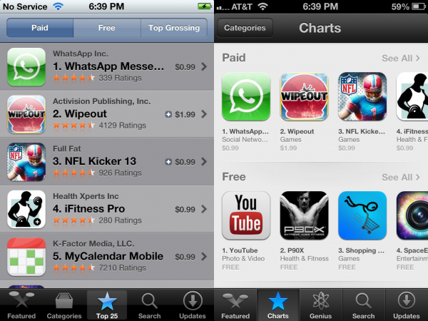
Take exposing the top paid, free, and grossing apps at the same time on the landing page of the Top Apps list, for instance. It seems like a small change, but it promotes free apps to the front of the page and lowers the exposure of the top paid apps past the first three. Michael Zaletel of i4software notes, "This gives MUCH MORE prominence to the Top Free Apps and so I predict Free apps and Freemium apps will see a big boost after today."
Top 25 - iOS 5 (left) vs. iOS 6 (right)
Another big change has been the app detail page. That page places much greater emphasis on the first screenshot and reduces the importance of the description. When landing on an app, the user will see a larger icon than before, the rating, and the first screen shot. Scrolling down they will see the truncated description and a few more details. Previously they user would see a small icon, the rating, and the top section of the description.
These changes on the whole place much greater emphasis on the icon and the name of the app. These must be compelling as they are--in most areas of the App Store--the only thing the user will see. Ratings, developer name, and description have all been hidden from initial view in multiple places in the store.
What this will mean to app sales, we'll have to wait to see. While it seems as though the changes are all for the better for the user, developers may need to prioritize their icon, name, and first screenshot much more than in the past.
